My Favorite Slinkachu's
The 'Little People Project' started in 2006. It involves the remodeling and painting of miniature model train set characters, which I then place, photograph and leave on the street. It is both a street art installation project and a photography project. The street-based side of my work plays with the notion of surprise and I aim to encourage city-dwellers to be more aware of their surroundings. The scenes I set up, more evident through the photography and the titles I give these scenes, aim to reflect the loneliness and melancholy of living in a big city, almost being lost and overwhelmed. But underneath this, there is always some humor.


I really like slinkachu's work because he remake's real events with little people
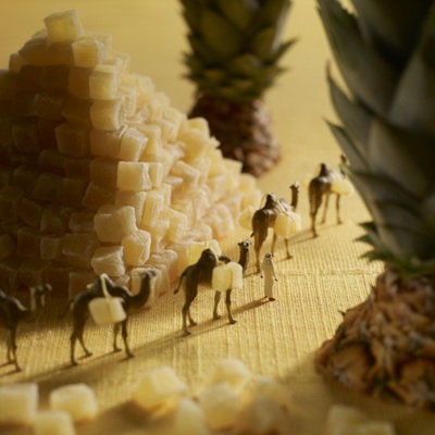
Akiko Ida and Pierre Javelle combine photography, magical landscapes, culinary backdrops, and portraiture to create settings inhabited by diminutive characters, referred to as minimum. Each picture reveals to the viewer a whimsical land that plays with our minds, as well as the subject.
The team met at Arts Decoratifs de Paris where they studied photography. Akiko, Japanese, has always been attracted to the world of gastronomy. As a child, she invented tiny characters that populated her journal. She is a renowned food photographer. Akiko has participated in more than 30 cookbooks and her work is published in international magazines. Pierre, French, grew up on comics. He is published in major gourmet magazines and his still-like photographs appear in corporate commercials.
This fine art collaboration, begun in 2002, is ongoing. There are over 30 works in the series at present.

|
|
Isaac Cordal
Tiny cement figurines have begun appearing on the streets of London. The street artist responsible is Isaac Cordal, who is originally from Spain but is currently based in London. Isaac Cordal's work is driven by the sculpture and installation itself. He would model his figures in clay; he also tries to create scenes which are recognizable behavior patterns. Cordal is interested in reflecting on current problems and provides coverage on them through art. The project is termed as cement eclipses, Isaac Cordal first began making cement sculptures in 2002 and first placed them out on the streets in 2006 in the Spanish city of Vigo. Cordal manages to capture a lot of emotion in his art, in spite of the lack of detail or color. His sculptures can be found in gutters, on top of buildings, on top of bus shelters – in many unusual and unlikely places in London. Cordal’s concrete sculptures are like little magical gifts to the public that only a few lucky people will see and love but majority of the people will have missed this opportunity.
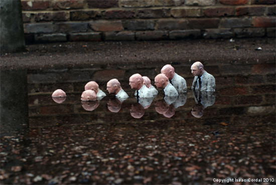
This image is successful because it tells a great story, it's as if recession has taken place and all the workers are hating their jobs. Also, it could be that they find work depressing and their life is being consumed by work. Furthermore, another reason why this image is successful is because your eyes are drawn to the focus point and this would lead you into working out the hidden message. Also, the reflection from the puddle makes this image successful. In my opinion this image is outstanding because the figures are drowning, this represents depression and death. Furthermore, this image is really effective because the photographer has included a depressing message. The photograph displayed is not too bright nor too dark, this shows that the exposure is perfect.
|
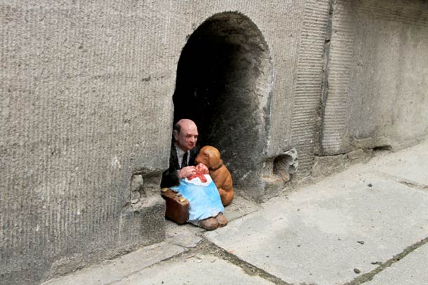
This image is successful seeing as it reflects poverty. The picture shows that the figures are poor and that they are stranded, and the business man could be their savior. The image also reflects on humanity as you can witness one of the figures saving the poor. Furthermore, I like this photograph due to the power spot, which is in the middle as this captures emotion. Also, the picture has a small depth of field which draws the viewers eyes to the main scene. This makes the photo unique.
|
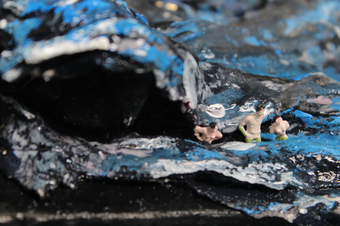
Slinkachu shoot camera settings
- DEPTH OF FIELD SHOULD BE : SMALL
- APERTURE SHOULD BE : F 5.4
- ISO SHOULD BE : 200-400
- EXPOSURE SHOULD BE : NORMAL
- FOCUS SHOULD BE: ON FIGURE
- SHUTTER SPEED SHOULD BE : 0.25
- WHITE BALANCE SHOULD BE: DAYLIGHT (OUTSIDE), TUNGSTEN (INSIDE)
- FLASH SHOULD BE: OFF
First shoot


First shoot Dislikes

This is the worst picture from shoot 1 because it is out of focus. You can not see the figures or the props properly. Also I do not think the angle is right.The picture is also to far out and you can not see what the picture is supposed to represent. There is a lack of concentration, a lack of focus in terms of me setting the camera correctly with the right aperture, and the right f-stop.
First shoot likes

I like this picture because it shows the worker organising a construction. You can tell he is taking charge and ordering the crane to move although I wanted to add more detail and to show more of a story line.
2nd shoot


2nd Shoot Dislikes

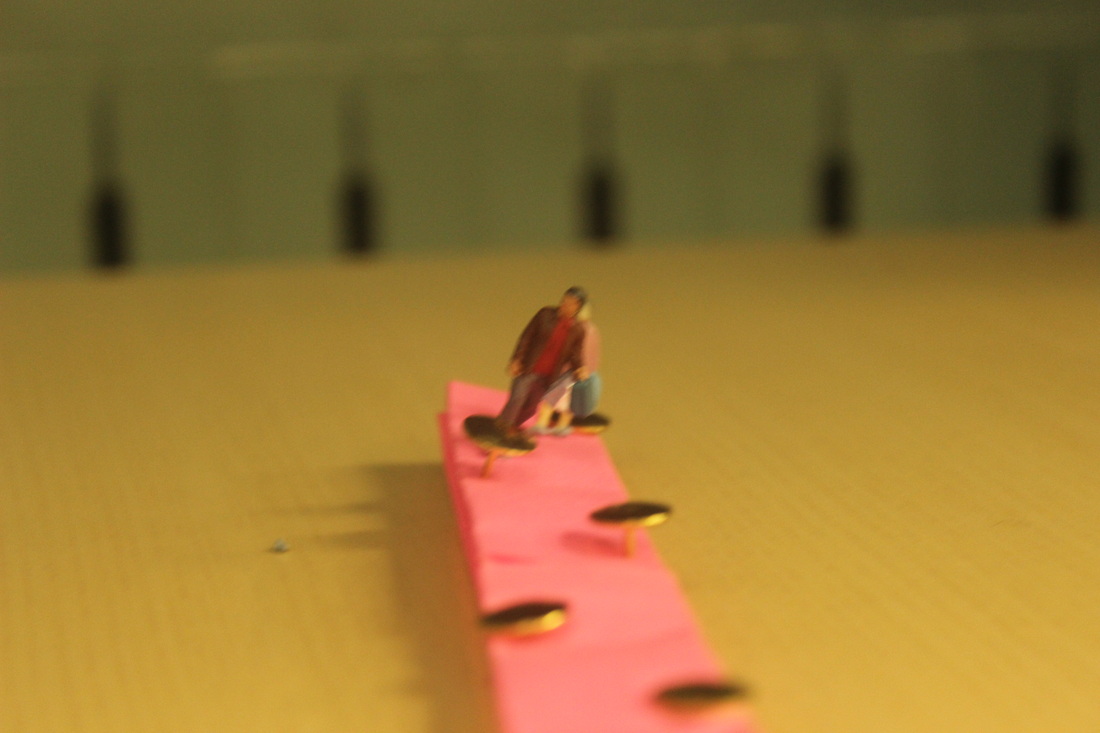
This is the worst photo I have taken. The reason why I think this is such a bad picture is because it is totally out of focus. You cannot see what the image is trying to represent, also you cannot see the boot.The viewpoint for the photo is wrong, and the angle the photo is taken from does not show anything. You cannot see the composition of the picture. It would of been better if I used shutter speed so that I could freeze the moment of the photo where the Slinkachu is climbing up the boot. This is the worst photo from my third Slinkachu shoot.
2nd Shoot Likes
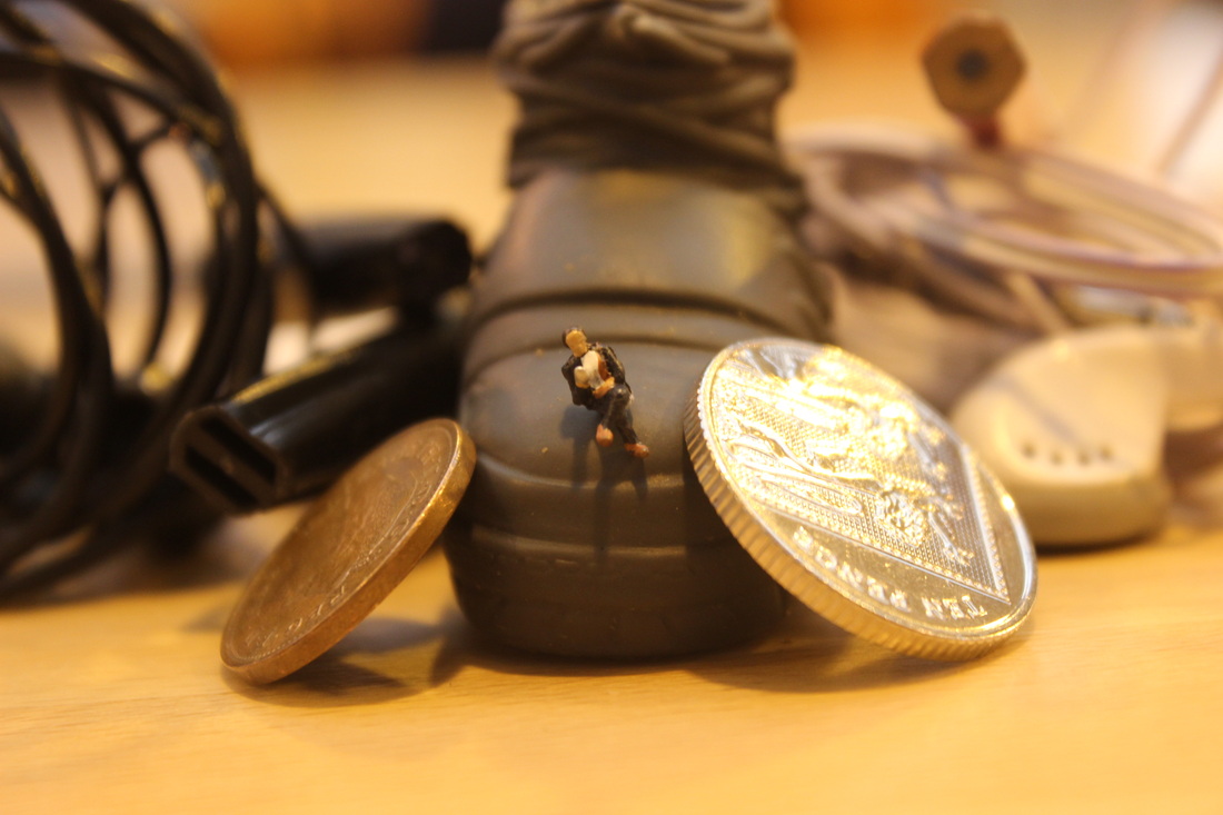
I like this picture because it shows the actual size of the Slinkachu figure compared to the coins and also it brings the picture to life with the different but unique objects.
Third Shoot


Third Shoot Dislikes

I don't like this picture because the picture is too dark (underexposed), also I don't like the way the camera is positioned
Third Shoot Likes
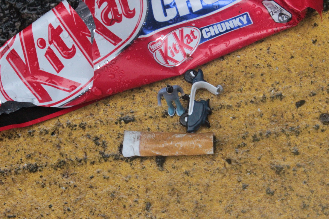
This is my best photograph from this take, the quality of the image makes it look HD. I have used a birds eye view and have focused on all of the objects used. The rain water on the kit-kat package adds detail to the image and makes it stand out. It is clear that the man has crashed in to the cigarette and has fallen off the scooter.
4th Shoot


4th Shoot Dislikes

I struggled to keep the two figures standing straight with the blue tack that I had as it wasn't enough. I tried to take the picture from the edge of the table, capturing the figures from a perfect position to make the image seem more effective which I wasn't able to do because the figures were on a slant.
4th Shoot likes
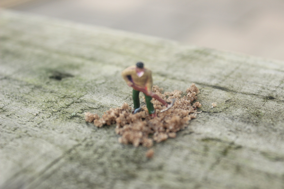
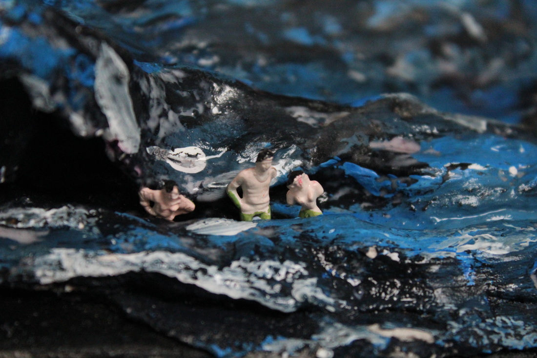
In my opinion I like this image because the exposure and the focus point are perfect. The focus point is centered in the middle and captures a story. This photograph shows that the figure could be a builder due to the image displayed, it's as if he is digging for something under ground . Furthermore, the figures outfit indicates that he is working in his own time due to the fact that he is not dressed for the job . The photograph also has a small depth of field which attracts the viewers attention to the main scene.
5th Shoot


Shoot dislikes

The reason why I don't like this image is because the slinkachu are being covered by the leaf and this affects the picture
Shoot likes
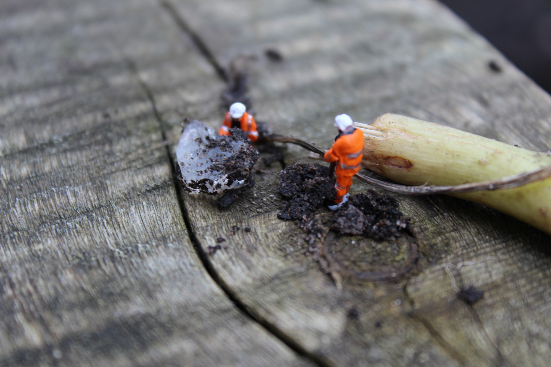
I like this image because in my opinion this image clearly shows the two workers who are cleaning up. The photograph is in focus and the focus point is exactly on the workmen and the depth of field is correct. However you can see the blue-tack which is distracting from the actual image.
Final piece


Worst photo

I picked this picture as the worst picture because the picture is out of focus and looks as if I have moved the camera whilst capturing the picture. The exposure is too dark and I took the photo at a birds eye view which did not work.
Edited photo
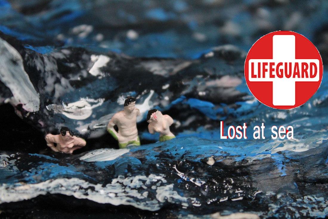
I like the angle of this picture because it really makes the slinkachu stand out. The life guard logo adds something different with the white and red theme, I tried to recreate it with the text and it didn't go as planned but overall its a good edit
Final edit
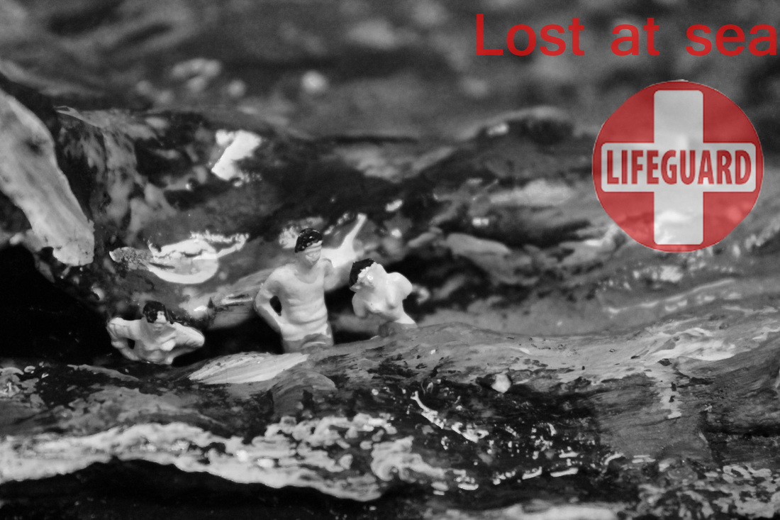
I picked this one as my final edit as it really stands out with the black and white, the background is shiny to show it's water around the lifeguard logo and the text catches the eye more as it is blurred into the photo.
